Moodle 4.0 will bring an exciting new course page structure to provide a more straightforward user experience and clean interface. Now is the time to declutter your Moodle courses to make the most of the new Moodle 4.0 course design.
Here are six quick tips to declutter your Moodle.
1. Put your files into folders
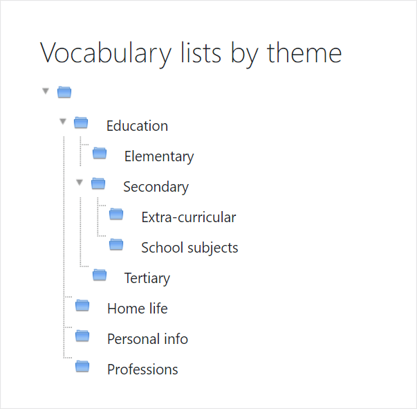
If you have a file-heavy course, with many presentations or documents, instead of listing them one by one, consider adding them to a folder. This has the benefit of not only shortening your course page but also allows you to organise your files into subfolders, which can then either display indented on the page or can be expanded when clicking the link.
2. Put your text into Books
If your documents (or presentations) are mainly text-based, why not display the content in a Moodle Book? These work like mini-websites where students can move back and forth between sections and they can be downloaded as a PDF file for offline printing. If you’re a fan of H5P, recent versions of Moodle allow you to add H5P activities to Books and record the grades.
If you only have one or two files, adding the content to a Moodle Page gives you the advantage of being able to also include images, video and weblinks along with your text.
3. Put your links into Pages
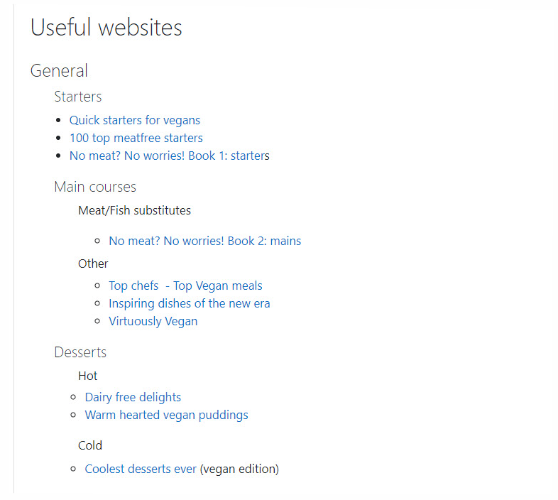
To save your learners the effort of identifying and locating relevant source websites, you can add URLs to your Moodle course. However, if learners must scroll through a long list of URLs, they may be discouraged from reviewing the sites you provide. A better alternative is to add weblinks into a Page resource. Give the URL an informative name, select the text, click the URL icon and add the weblink. Adding them to a Page also means you can categorise your weblinks in an order useful to you and your learners.
4. Use ‘One section per page’
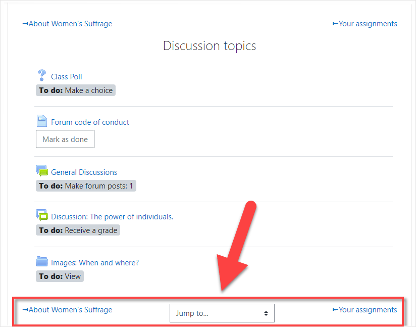
The most popular course format, Topics and Weekly, can become overwhelming if you have a large number of sections. The course layout option “show one section per page” allows learners to focus on just the section they need at that time. Arrows allow for navigating to the previous and next section, with a ‘jump to..’ dropdown to return to the main page with all sections displayed.
5. What about completion tracking?
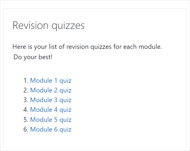
Some teachers choose to add resources such as files or URLs individually because it allows them to add completion tracking to each item. For example, learners can go through each item manually marking them as ‘Done’. Leaving aside any pedagogical discussions, if this is important to you, it might be worth reading up on Stealth activities. This is an advanced feature whereby a teacher can link to resources or activities that are available but unseen on the course page. If you have 10 important quizzes, for example, add them as stealth activities and copy and paste their URLs into a Page, as here:
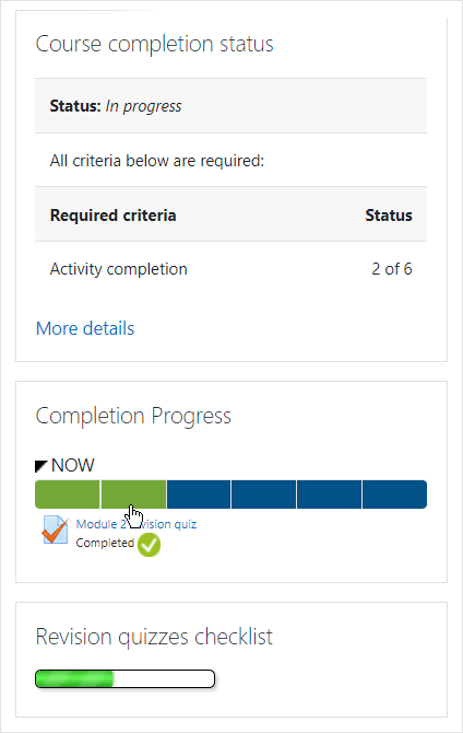
Learners will be able to mark items as complete manually when they click into them, and automatic completion will also work. If course completion is enabled, learners can see their progress from the Course completion status block. Alternatively, take a look at the Completion progress block or the Checklist, both of which provide very clear indications of learners’ tasks in a course. This screenshot shows three ways of displaying completion tracking with unseen or ‘stealth’ activities:
6. Restrict access to course activities
Another way to declutter your course is to only show learners what they need to do at a particular time. With Moodle’s Restrict access feature you can, for example, display the first week or topic and make other sections visible once an activity has been completed or a certain date has passed.
7. Explore other course formats
If extra plugins are allowed on your Moodle site, it’s worth exploring contributed course formats which help streamline the display. The Collapsed topics course format is one of the most downloaded plugins on Moodle and is specifically designed to reduce the “scroll of death”. The Moodle plugins directory has a number of formats you might like to investigate, making sure they are compatible with your version of Moodle.
This article was originally published on moodle.com

