Moodle LMS 4.2 has arrived and it brings a swag of improvements you’ll just love! In this article we will explore some of the new features.
Let’s start with the enhancements it brings to your courses.
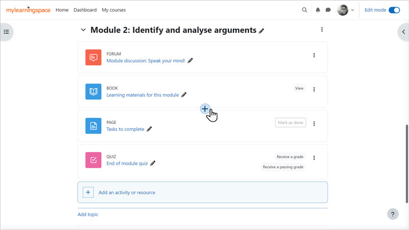
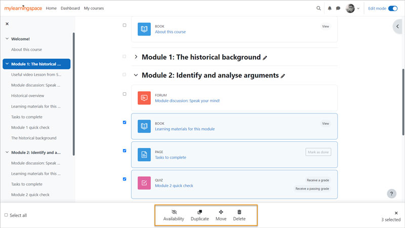
Gone are the days of only being able to add an activity or resource to the bottom of a section and then moving it to the desired location. You can now add activities and resources wherever you like! You can also now perform bulk editing of activities and resources such as deleting, moving, duplicating, and changing visibility.
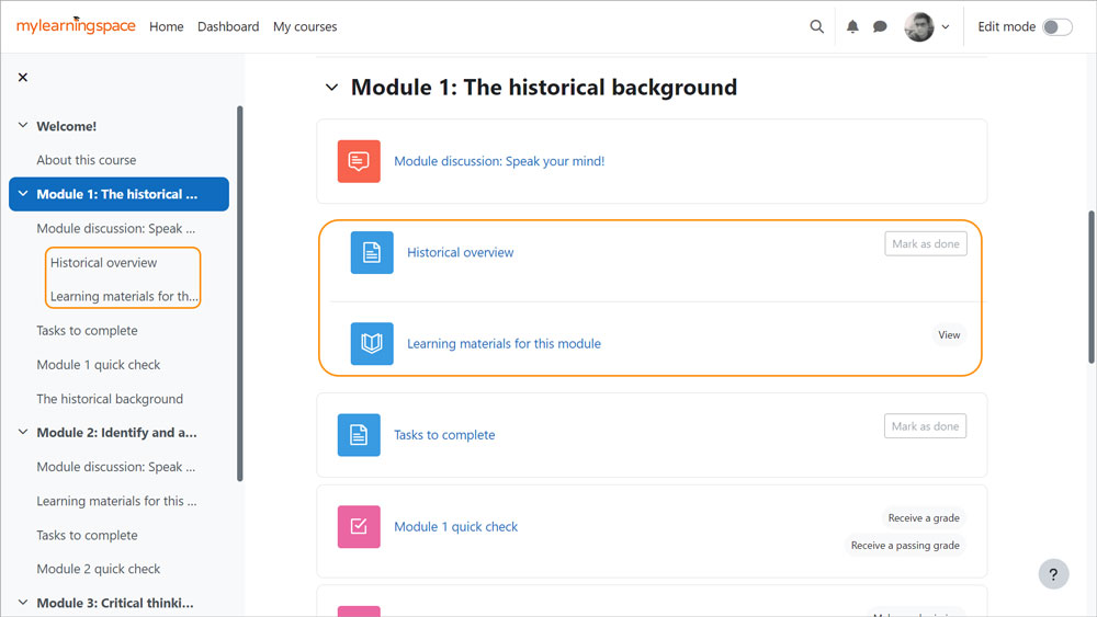
The ability to indent activities and resources on a course page is back, but if you don’t miss that feature you can leave it turned off. If you do allow indentation, courses are kept clean and simple by only allowing one level of indentation. The indent will apply to both the course page and course index.
Another way you can now keep your course pages clean and simple is the new ability to turn off activity and resource names when edit mode is off. This can be a great way to simplify courses while still viewing module names when you are in edit mode.
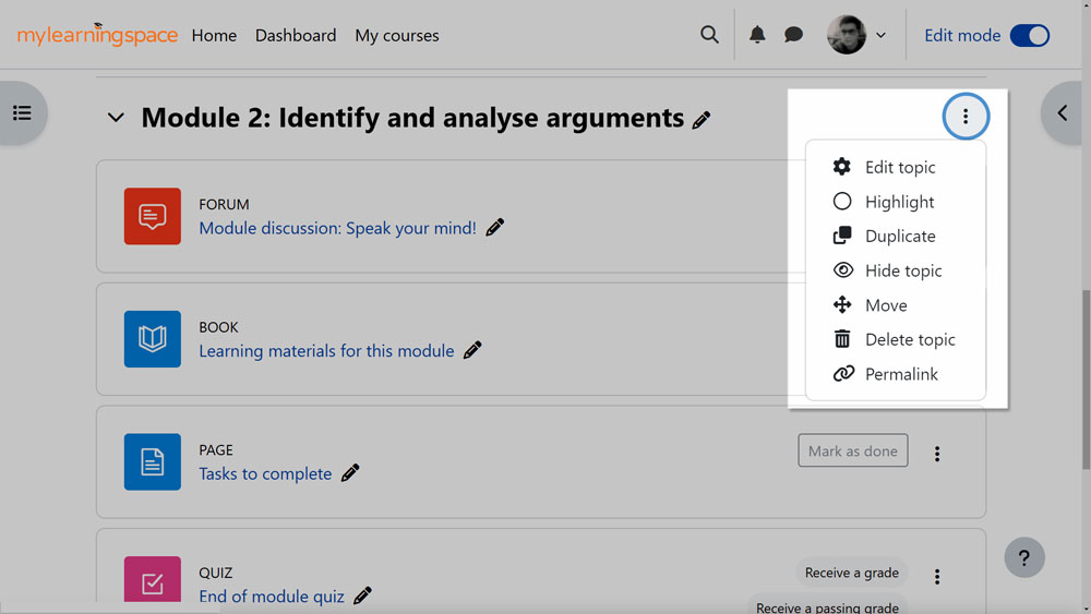
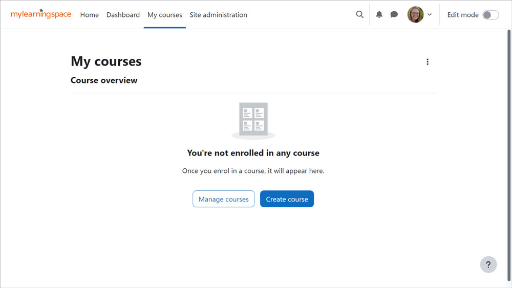
Course sections also received an upgrade with the ability to now duplicate an entire section, making editing quicker and easier. Plus you can now grab a permalink to a section which is really handy if you are wanting to link to a specific section. The ‘My courses’ page has also had an improvement with new buttons and links available for students, teachers and site administrators.
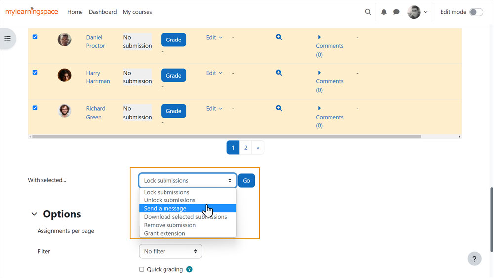
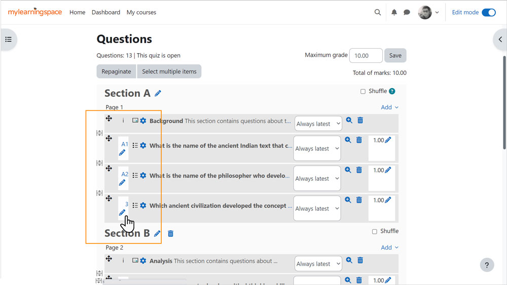
A couple of the course activities have also received improvements with quizzes now allowing you to customise question numbers plus you can reopen attempts that were never submitted. In assignments, you can now send messages to students from the ‘View all submissions’ page.
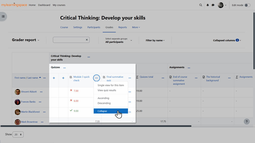
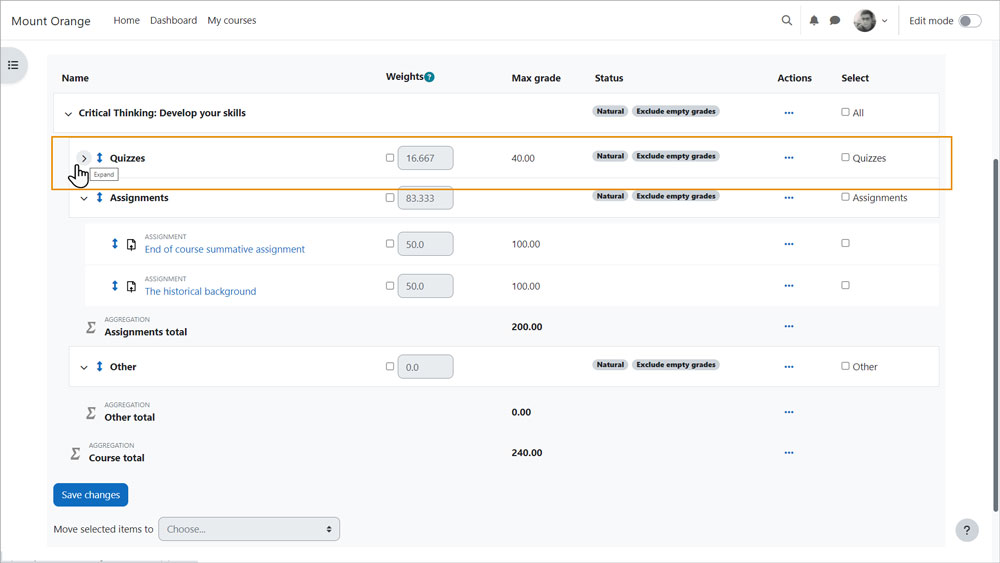
Grades have also received some enhancements. You can now search and filter the grader report as well as being able to collapse columns and view feedback. When you are setting up how grades work in the gradebook setup, you can collapse categories to make it quick and easy to view and organise.
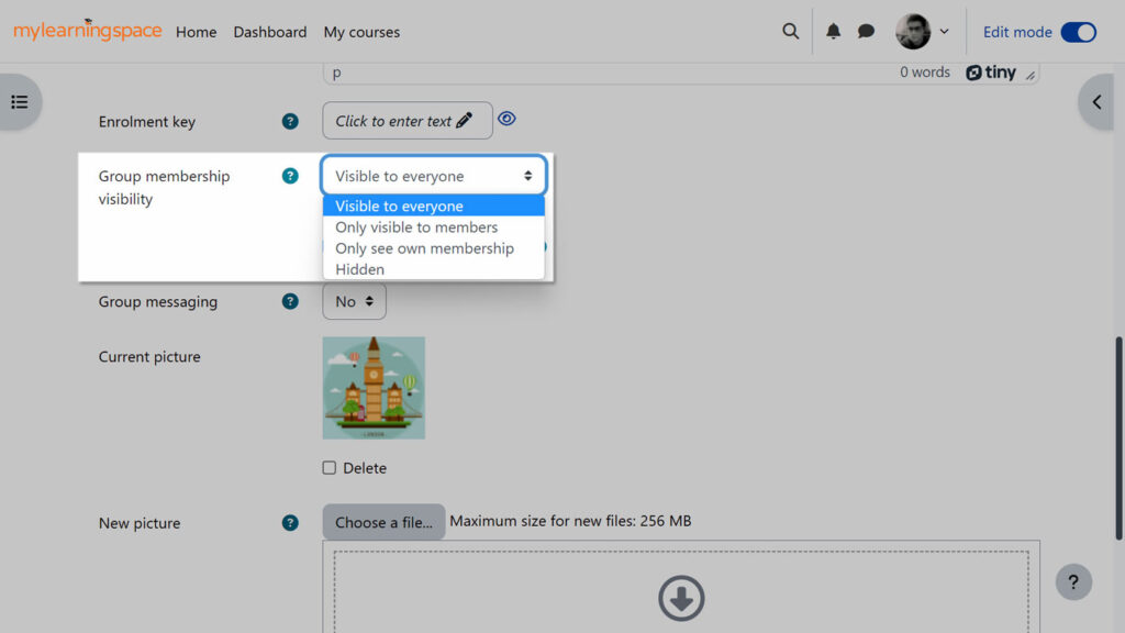
Groups have also received an upgrade within courses, as you can now control group membership visibility by choosing from visible to everyone, only visible to members, only see own membership or hidden.
Site administrators also benefit from Moodle 4.2. Let’s take a look.
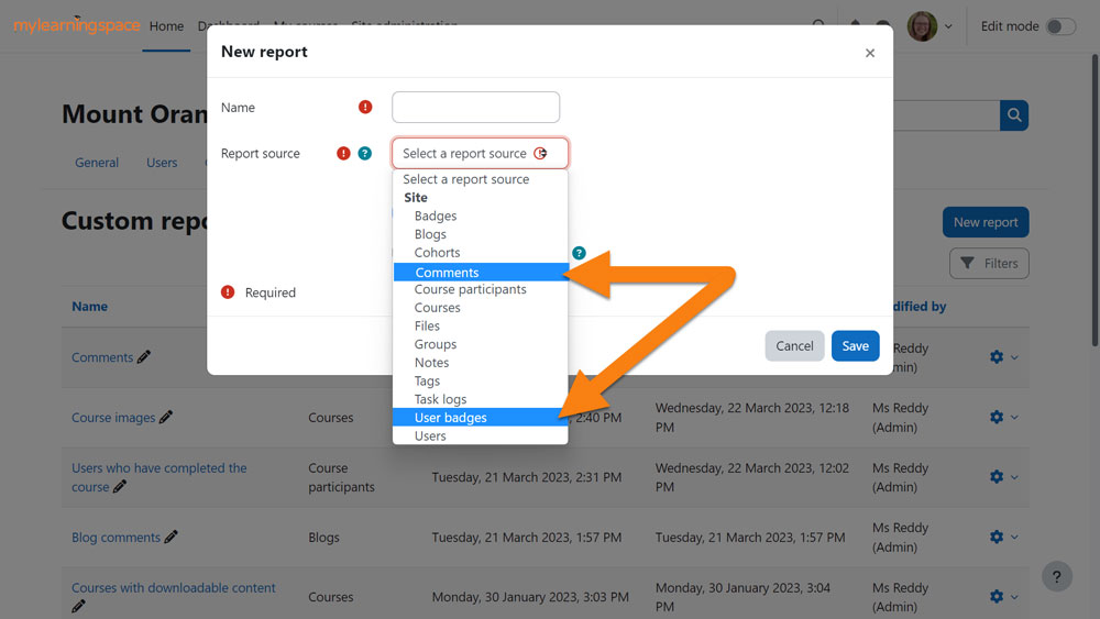
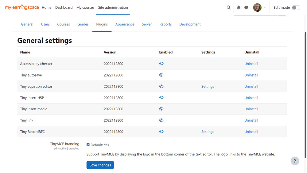
Some new features include the Report Builder has a new report option of ‘User badges’, while the ‘Blog comments’ report has new time filters available. Administrators can now also control the availability of features in TinyMCE and it is also now the default text editor in new Moodle sites.
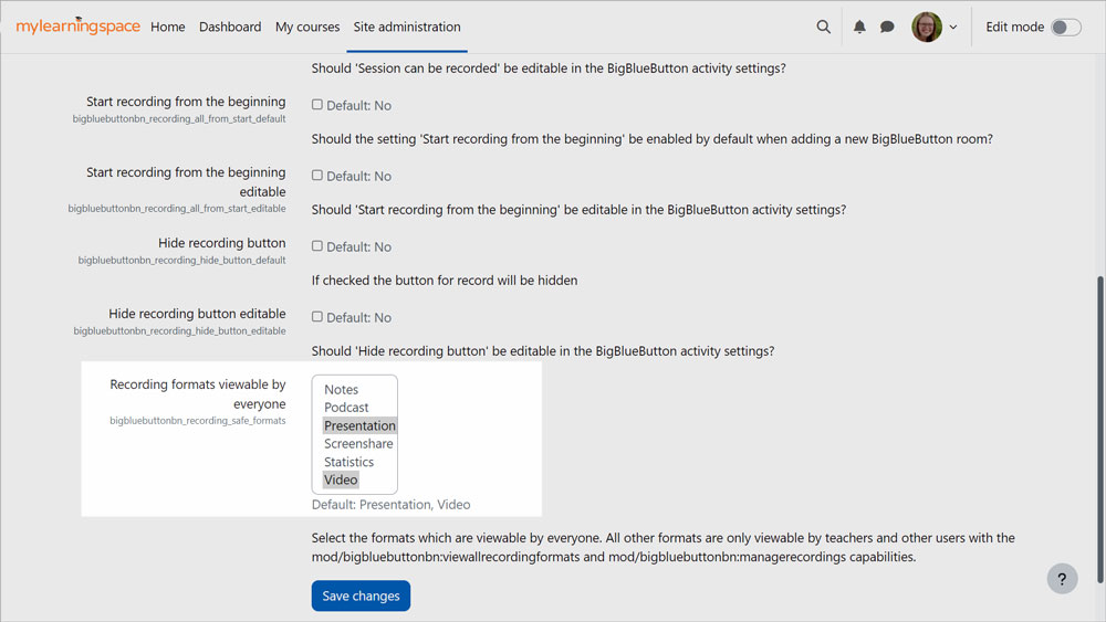
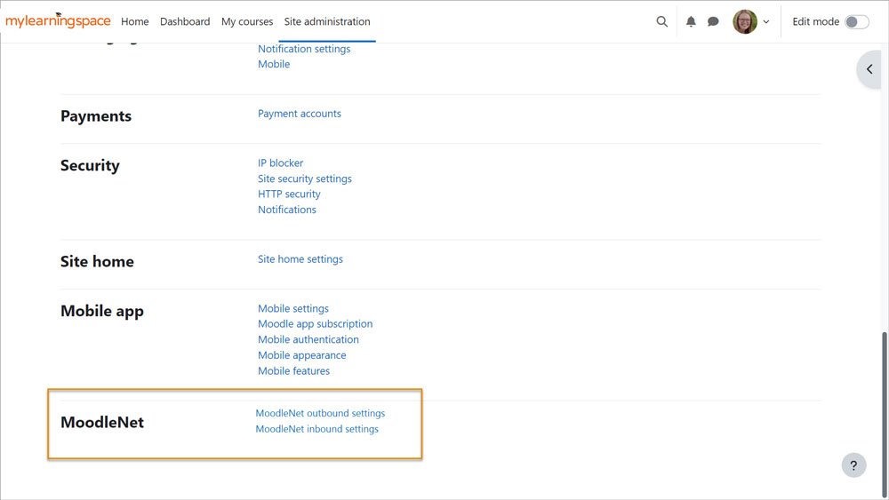
Big Blue Button now allows you to choose whether to show profile pictures in Big Blue Button sessions and to choose which recording formats learners can view. MoodleNet integration is now available in the experimental settings, which means you can start allowing sharing of activities to MoodleNet.
So there you have it, a whole swag of great improvements in Moodle LMS 4.2. So now it’s time to check out these new features in your Moodle site. To learn more, feel free to visit the Moodle LMS 4.2 New Features page and Moodle LMS 4.2 Tutorials playlist.


